

I recently found my high school textbook of Hamlet. A number of things about that edition surprised me, the first being that it was an interlinear edition, suggesting that we could not read Shakespeare without a trot or pony. I remembered such editions from my Latin classes, where of course they were forbidden, scorned as crutches, and used only surreptitiously outside of school. The second thing that caught my attention was that the fore-edge of my Hamlet was crudely marked in black ink with the school motto, as was the inside endpaper of the front cover: Tolle lege. Since magic markers did not exist in the early fifties I assume I’d used India ink, perhaps the stopper from the bottle, an ink our mothers used to identify our childhood underwear and clothing before sending us off to camp or, in my case, away to a military boarding school. (During the Second World War, I was known as “the little soldier,” as well as “the little man,” and all of our family of three were in uniform for the duration, my father a naval officer, my mother in the Red Cross, and myself in an itchy woolen miniature of West Point gray, impossible in the Southern California heat.) That same India ink we also used in gang initiations, for tattoos. Thirdly, across the free endpaper of my Hamlet sprawls the scrawl of my signature, blatantly less interested in legibility than in securing some adolescent dream of singularity, as the tattoos were supposed to have done at a slightly earlier period.
My high school, St. Augustine’s, was run by Augustinian priests who prided themselves on being one of the original teaching orders. It was an all boys’ school, the only one in a county boasting eight Catholic girls’ schools, where the nuns lectured the girls that they should only date Catholic boys. We used to taunt the most pious boys by wisecracking that, after all, Martin Luther had been an Augustinian, a joke not regarded as witty by the priests. The school motto, as I mentioned, was Tolle lege, Take it and read. The origin of this phrase marks one of the most remarkable moments in Augustine’s Confessions, his conversion in the garden in Milan. Sitting under a fig tree Augustine hears a child’s voice chanting as if in the singsong of some children’s game, Tolle lege. Tolle lege. He has been in an agony of desire, torn between two warring wills, those of his higher and lower natures. The book he has at hand in the garden is the Epistles of St. Paul. He seizes it and opens it at random, a sortilege of longing and agony. The book opens to Romans 13:13, 14: “Not in reveling and in drunkenness, not in lust and in wantonness, not in quarrels and in rivalries. Rather, arm yourselves with the Lord Jesus Christ; spend no more thought on nature and nature’s appetites.” Augustine continues, “I had no wish to read more and no need to do so. For in an instant, as I came to the end of the sentence, it was as though a light of confidence flooded into my heart and all the darkness of doubt was dispelled.” (Bk 8:12.) Sortilege, which means divination by using a book, was also practiced in the Roman Empire by consulting the Aeneid.
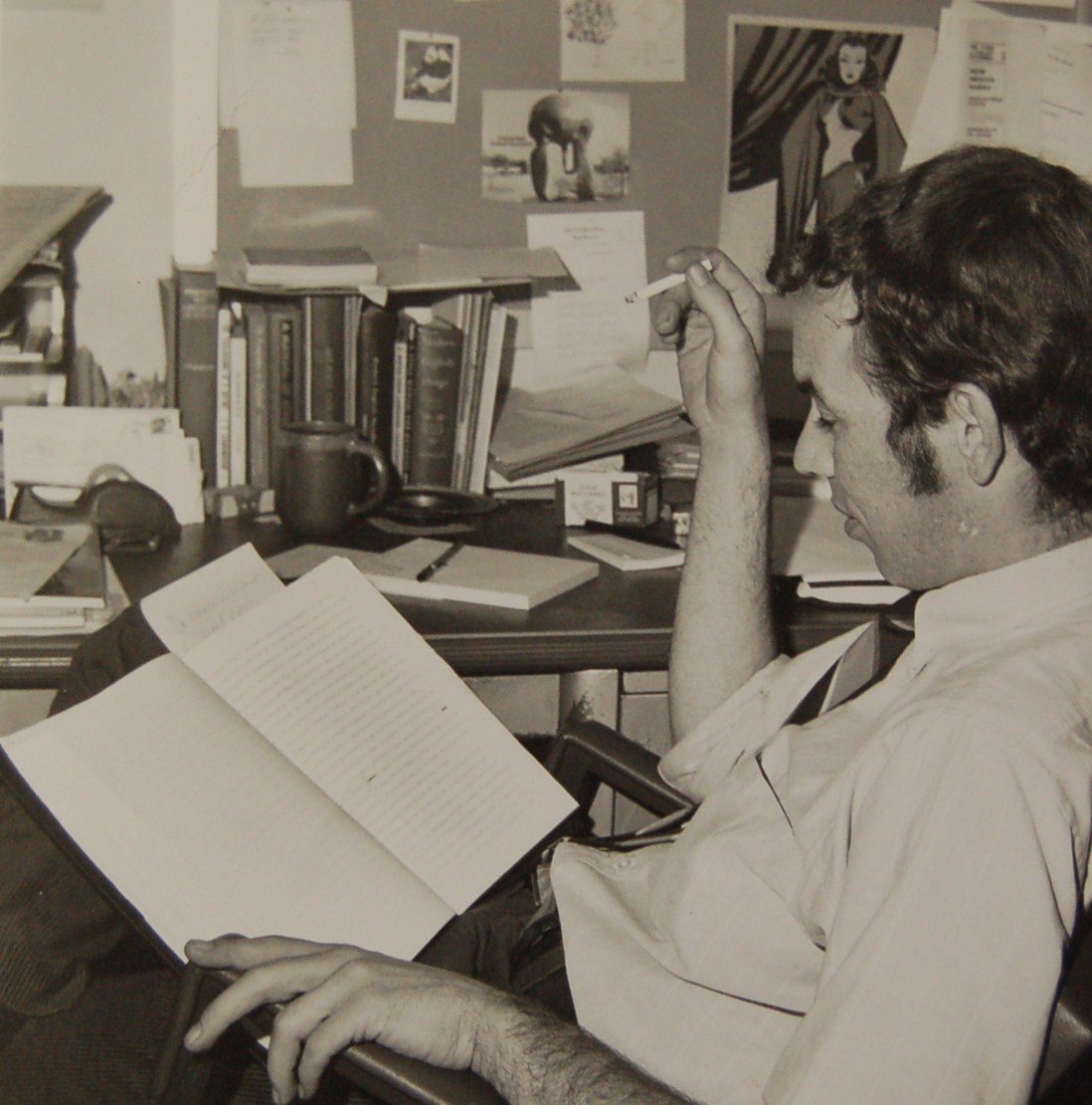
Augustine’s conversion was from the flesh to the spirit. The state of his agonized longing is structurally characteristic of adolescence. The state of my own adolescent longings was in the opposite directions. Such pieties and theological longings as I may have possessed disappeared (agonizingly, of course) when, at age nineteen, I began my first long term sexual intimacy. Nineteen was the age at which my namesake resolved, upon reading Cicero’s Hortensius, that philosophy would be his path. The antithesis of Romans 13 was my philosophical path: sex and drugs and jazz (rock-and-roll I fellow-traveled for the sex and drugs). So it was two summers after the summer of love, 1969, that I first met Jack Stauffacher. This brings me, less circuitously than might appear, to continuing my praise of Jack’s Greenwood Press, directly now rather than obliquely.
Unbeknownst to me, my eventually meeting Jack began three years earlier, when I was an editor at the University of New Mexico Press working on books and also on the New Mexico Quarterly. When I joined the press, its production was notoriously low, mainly because the director insisted on designing many of the books himself and was extremely slow. A university-wide study group concluded that the one thing the press needed above all else was a professional designer. So in 1966 the press hired Frank Mahood, a student of Jack’s at Carnegie Tech and later the designer at Syracuse. I remember the coincidence of looking through his portfolio and noticing that he had designed Ernest Bacon’s Notes on the Piano. Joseph Bacon, guitarist, lutanist, painter, and philosopher, had been a friend of mine since college, and I always took such coincidences as serendipitous. Joe has been a friend of Jack’s for some time. It is not so much that what goes around comes around as that things meant to be will connect.
When he arrived, the first book that Frank designed happened to be the first book I had edited for UNM Press. So it was here that I began to learn about the art of typography, here I first heard Jack’s name and learned how he taught Frank the use of Bodoni, the first name of a type that I ever heard. Prior to Frank’s tenure I knew nothing about typography.
On Thanksgiving Day 1966, Alan Swallow, whose books I had been distributing locally since moving to New Mexico, died at his typewriter in Denver. I began commuting to Denver on weekends to help with running Swallow Press, and it happened that my great teacher Yvor Winters’ last two books, Forms of Discovery and its companion anthology, Quest for Reality, were mine to design. I was thrilled; Frank, whose guidance I sought, was reluctant but helpful nonetheless. I learned about Gill faces for the first time, and got a firsthand acquaintance with Electra, which was the body type for New Mexico Quarterly, and Perpetua. It was in this period of enthusiasm that I first read Updike (D. B., not John). The last book I designed, and the only one for UNM Press, was N. Scott Momaday’s The Way to Rainy Mountain. The connections between all the dramatis personae in the little drama of Rainy Mountain–Swallow, Winters, Momaday, Mahood, Stauffacher, and me–is worth a digression, especially since I seem to recall once hearing that the essay is the art of controlled digression. The question is where to start disentangling the actors so they can be re-entangled anew.

Winters sent me a copy of The Reporter containing a memoir of Momaday’s of the same title as the book to be, a remembrance of his Kiowa heritage. The appended note from Winters stated that Momaday was the greatest poet in the language since, I suppose, Frederick Goddard Tuckerman, whose poems Momaday edited for a new edition in 1965, and he is the youngest poet included in Winters’ critical summa, Forms of Discovery. Winters also mentioned that New Mexico Quarterly had first published Scott’s early poetry and that Scott had a novel with Harpers, and that Swallow had rejected a poetry collection.
After reading Scott’s memoir and early poetry, and contacting his editor at Harper and Row, who chanced to be a college classmate, I wrote Scott suggesting he consider a book along the lines of his Kiowa memoir. He replied that a livre de luxe of further Rainy Mountain material was forthcoming, that he would send a copy along, and then, depending on what I thought of the new material, we could think about a book. I thought the additional material was as wonderful as the original. Scott put a manuscript together so well written that it needed no editing, and in accordance with the press rules, we submitted it to outside readers–anthropologists, alas. They determined it wasn’t anthropology and objected to its James Fenimore Cooper-like sentimentalities. Normally, this would have finished the book. But I was outraged at their imaginative insensitivity and their critical superciliousness, their willful proprietarian ignorance. So I decided to resubmit the manuscript to a new selection of outside readers–writers, this time, not anthropologists. Janet Lewis, Evan Connell, William Gass, William Eastlake, Paul Horgan, Wallace Stegner, Edward Abbey, and others responded at length to the literary masterpiece that Rainy Mountain is. Loaded for many bears with a lot of big guns, I took the book to committee where it passed unanimously.
Design was the next task, which I undertook enthusiastically under Frank Mahood’s tutelage. Optima had become a fashionable passion of mine and Frank guided me in the layout. Italics (or oblique) sections we set in type outside the printing plant at Joe Reay’s Typographic Service, the only fonts of Optima in the state. At this point Scott suggested his father, Al, a distinguished Kiowa artist, as illustrator. Frank decided the illustrations should be bled, printed without any boarder or frame on the entire page. We picked the cloth for the binding and Frank did the title page. I go into all this to correct the misattribution of the design to Bruce Gentry, who did only the layout of the dust jacket, from designs of Frank’s and mine. But Frank, working for a typographically ignorant commercial director, left in 1968. I followed in 1969, and when I saw finished copies of the book I was outraged at Gentry’s crediting himself with a design that was, beyond the wrapper, in no way his.
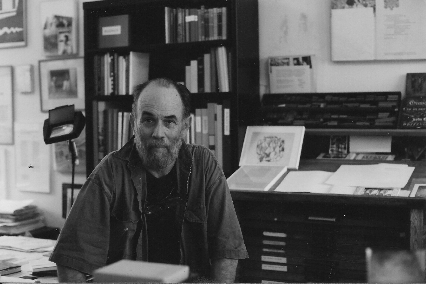
This was the summer, 1969, in which I first met Jack, who had left Stanford University Press under circumstances similar to Frank’s and my departures from UNM.
1999
Published as “A Vigorous Lucidity” in A Typographic Journey: The History of the Greenwood Press and a Bibliography, 1934 – 2000, San Francisco, Book Club of California, 1999. This version is from an undated computer print-out manuscript inscribed with marker: “Stauffacher / Book Editing History.”
